Brand identities built to work on every screen they meet
Strategy, naming, logo and visual identity, and the guidelines that keep it consistent — designed by the team that builds the product it lives on.

A brand is a promise made in a glance. We make sure it is the right promise, and that it holds up from the app icon to the billboard.
We start with what the business stands for and who it has to convince, and put that into words — positioning, name, voice — before anything is drawn. The identity comes out of that thinking, not out of a mood board.
Because we design and build digital products too, every identity is made for screens first: a mark that survives a favicon, colours that pass contrast, type that renders well, and a system that carries straight into the website and the app.
What you get with us
A small senior team that has designed, built and shipped products together since 2024, and stays with the project to the end.
Strategy before style
Positioning, audience and voice agreed in writing before the first sketch, so every design decision has a reason behind it.
A system, not a logo
Mark, colour, type, imagery and motion designed together, so the brand still looks like itself on its hundredth application.
Made for screens
Tested at favicon size, in dark mode and on a cheap display — the places a brand actually lives now.
Carried into the product
The same team takes the identity into the website and the app, so nothing is lost between the guidelines and what ships.
From the name to the rulebook
- Positioning
- Naming
- Voice
What the business stands for, who it is for and how it should sound — written down, tested against the competition, and turned into a name and a voice when the brand needs them.

Brand strategy & naming
- Logo
- Colour
- Typography
- Imagery
The mark and everything around it: colour, type, imagery, iconography and motion, designed as one system and tested on the screens and surfaces it will actually meet.
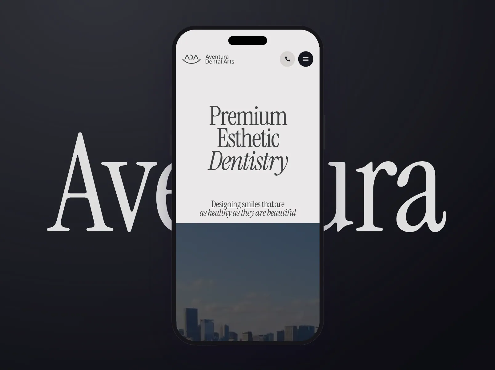
Logo & visual identity
- Guidelines
- Templates
- Asset library
A rulebook your team will actually open: usage, spacing, do’s and don’ts, templates and a clean asset library, so the brand stays consistent long after we hand it over.
Brand guidelines
- App icons
- Websites
- Store assets
The identity applied where people meet it: the website, the app icon, store listings, social and the product itself — designed and built by the same team, so nothing gets lost in translation.

Brand for digital products
From strategy to guidelines, step by step
Words first, then pictures: each step ends with something you can react to before we move on.
What a brand has to survive


The smallest size first
A mark that works as a 16-pixel favicon and an app icon will work anywhere. We design down before we design up.
Get a quoteConsistency without a brand police
Good guidelines make the right choice the easy one: templates, tokens and examples, so a new hire can make something on-brand on their first day.
Get a quoteBuilt by the people who ship
The identity is designed by the same team that builds the website and the app, so it arrives in the product exactly as it was drawn.
Get a quoteWho comes to us for a brand
New businesses
Starting from a name and a plan, and needing to look established from day one.
Growing companies
Whose brand no longer matches what they have become.
Product teams
Launching a product that needs its own identity, made for screens.
Testimonials

“Working with Axtra Studios was fantastic! They were very communicative & flexible. We will definitely be hiring them for future projects!”
- Stephen Fullington
- CEO, CoreTrex
Questions, answered
The strategy document, the logo in every format you will need, the colour, type and imagery system, templates for the everyday things, and brand guidelines with an asset library — all yours, with a walkthrough for your team.
Yes — that is the point of doing both. The same team carries the identity into the website and the product, so nothing is lost between the guidelines and what ships.
In milestones, against a written scope: you see the whole estimate before anything starts, and you pay as each part is delivered and approved. We would rather shape the scope to fit your budget than lose a good project over price — so if the number is the obstacle, tell us, and we will find the version of the work that fits it.
The co-founders lead every project — Zafar on strategy and the client relationship, Shahzaib on engineering, Subhan on delivery — with our designers, developers and QA doing the work alongside them. There is no account layer between you and the people building it.
Yes — that is the point of working in two-week cycles. Every sprint ends with a review, and what you see there shapes the next one. Changes inside the agreed scope are part of the work; changes to the scope are re-estimated, in the open, before anyone builds them.
You do, always. The code sits in your repositories, the designs in your Figma, the deployments and accounts in your name, with documentation and a recorded walkthrough. Nothing is locked to us — and most of our clients stay on for the next phase anyway.
Let’s give your businessa face people remember.
UX/UI design
Research-led product and interface design for teams that want software people actually finish using.
Explore