UX/UI design that people don’t have to think about
Research-led product and interface design for teams that want software people actually finish using.

Good design is invisible when it works. We design the flows first, the screens second — so the interface carries people to the thing they came for and gets out of the way.
We start with the plan of the product, not its paint: what exists, how it connects, and where each path ends. That plan comes from stakeholder interviews, competitor teardowns and recorded sessions with real users, so every screen we draw answers something we saw.
The surface comes second and gets the same care: type that reads at arm’s length, colour that survives a cheap screen, motion that explains rather than decorates. It all lands in a component library your developers can build from, not a folder of flat mockups.
What you get with us
A small senior team that has designed, built and shipped products together since 2024, and stays with the project to the end.
Research first
Interviews, session recordings and competitor teardowns before a single screen is drawn. We design against evidence, not opinion.
Systems, not screens
Every project ships a design system — tokens, components, states — so the tenth screen is as considered as the first.
Mobile as a first draft
We design the smallest viewport first. If a flow works with one thumb, the desktop version is easy; the reverse is never true.
Built to be built
Designers and engineers sit at the same table. Nothing is handed over that can’t be implemented as drawn.
Where we start depends on where you are
- Web apps
- Mobile apps
- SaaS
- Dashboards
Interfaces for products people use every day. We sort what a user does every hour from what they do once a month, design the everyday screens to need no manual, and keep the rare ones easy to find — for web apps, mobile apps and SaaS alike.
Product design
- Workshops
- User research
- Scoping
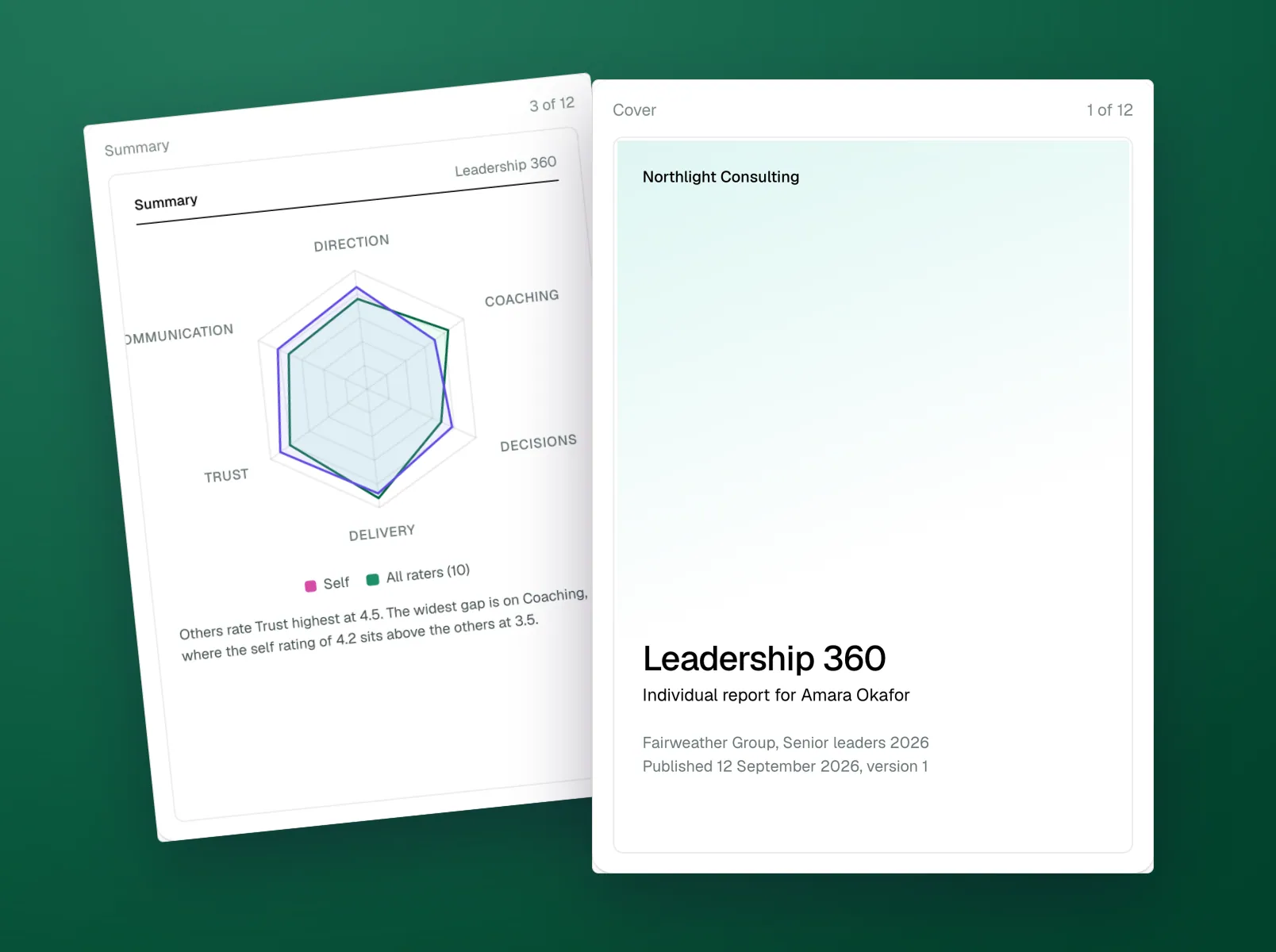
Before anything is designed: interviews with the people who will use it, a teardown of the competition, and a workshop that turns what we learned into a scope, a flow map and a plan you can take to your team or your investors.

Product discovery
- Usability review
- Analytics
- Conversion
For a product that already exists and is leaking users. We review it screen by screen against your analytics and recorded sessions, rank what is broken by what it costs you, and hand over the fixes in order — most of them small.
UX audit
- Tokens
- Components
- Documentation
Every project ships one, and we build them on their own for teams that need one: tokens, components and every state, documented in Figma with a twin in the codebase, so the tenth screen is as considered as the first.
Design systems
From first interview to handoff
Discovery gives us the map; design turns it into screens people finish using. Every step ends with something you can react to.
Three rules we design by
Evidence before opinion
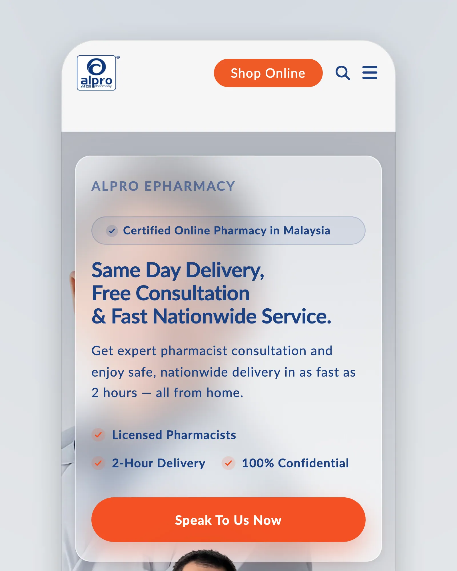
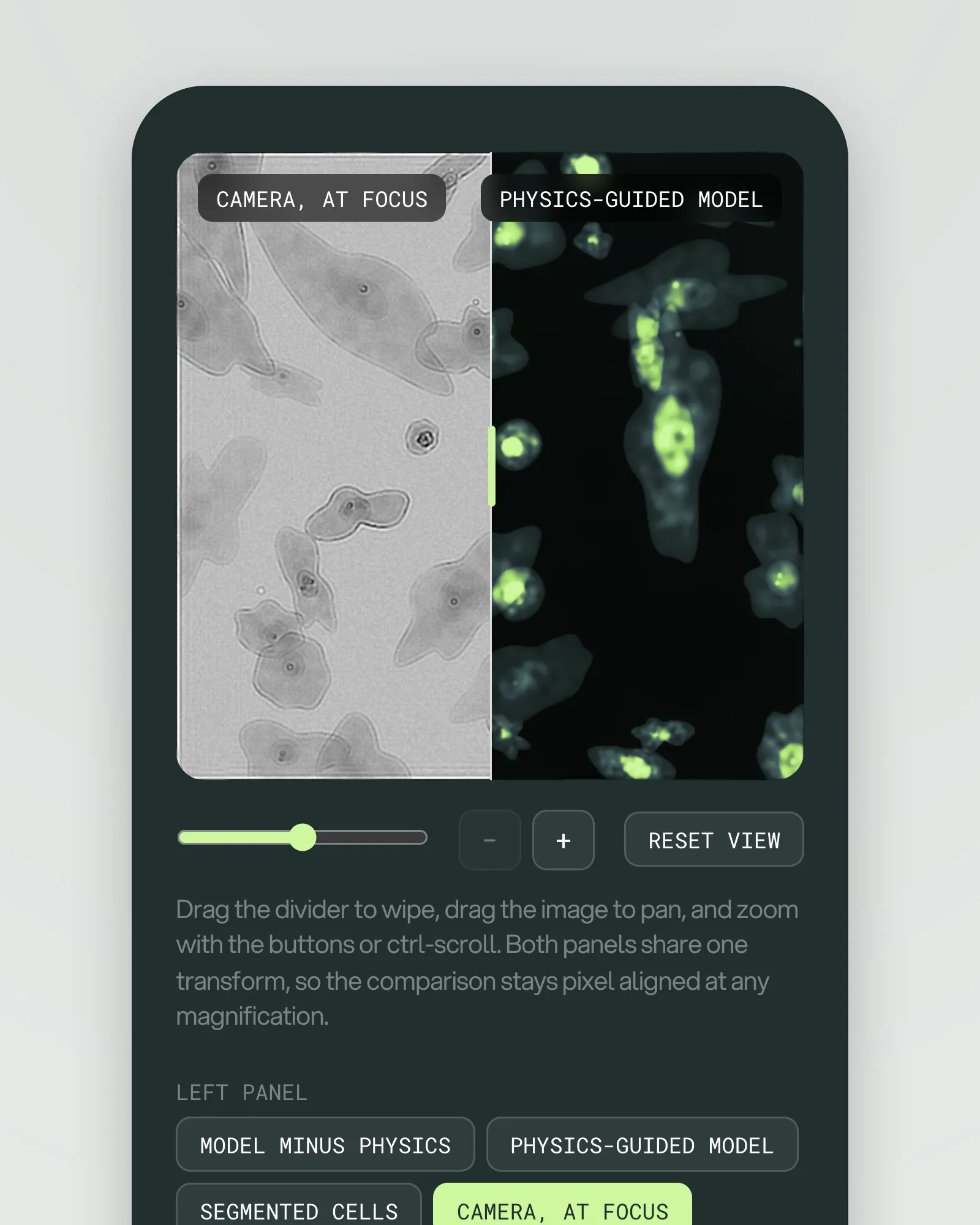
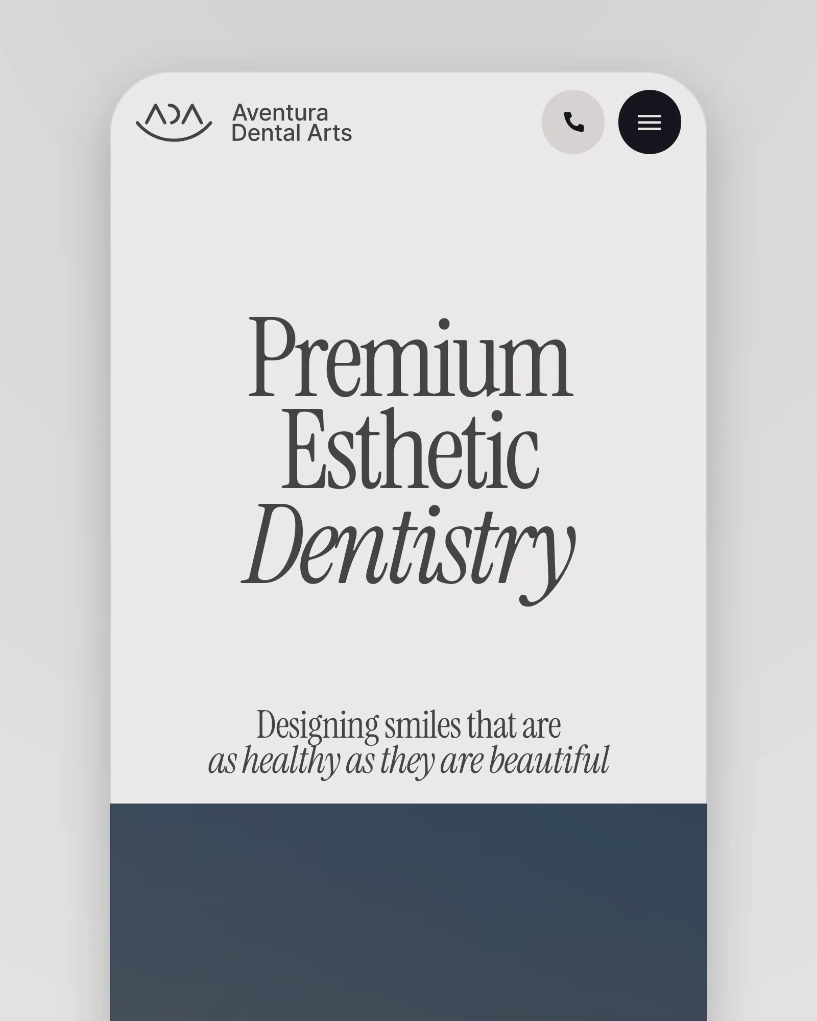
Taste settles arguments too early. We record people using the product, read the support inbox and the analytics, and bring the three worst moments to the first workshop, so the design starts from what is broken rather than from what is fashionable.
Get a quoteTied to a number
A beautiful interface that doesn’t move a metric is decoration. Each piece of work names the number it should change, whether activation, conversion, retention or support load, and we look at that number again after launch.
Get a quoteDrawn by people who build
The people who design the screens work beside the people who write the code behind them. Feasibility is settled at the sketch, every component in Figma has a twin in the codebase, and nothing is lost in a handoff.
Get a quoteThe teams we design for
Businesses
Looking to unlock growth from a product that has hit a wall. We find the next door.
Startups
From pre-seed to Series B. Speed matters, so we bring momentum as well as craft.
Founders
With an idea and a deadline. We turn it into something you can put in front of users and investors.
Testimonials

“Working with Axtra Studios was fantastic! They were very communicative & flexible. We will definitely be hiring them for future projects!”
- Stephen Fullington
- CEO, CoreTrex
Questions, answered
UX is the structure — what exists, how it connects, how people move through it. UI is the surface — type, colour, components, motion. We do both, in that order: the structure is settled in wireframes before the surface is designed, so aesthetics never paper over a broken flow.
Every screen and state in Figma, a documented design system with tokens and components, a clickable prototype, the research findings, and a recorded handoff with your developers — or with ours, if we are building it too.
In milestones, against a written scope: you see the whole estimate before anything starts, and you pay as each part is delivered and approved. We would rather shape the scope to fit your budget than lose a good project over price — so if the number is the obstacle, tell us, and we will find the version of the work that fits it.
The co-founders lead every project — Zafar on strategy and the client relationship, Shahzaib on engineering, Subhan on delivery — with our designers, developers and QA doing the work alongside them. There is no account layer between you and the people building it.
Yes — that is the point of working in two-week cycles. Every sprint ends with a review, and what you see there shapes the next one. Changes inside the agreed scope are part of the work; changes to the scope are re-estimated, in the open, before anyone builds them.
You do, always. The code sits in your repositories, the designs in your Figma, the deployments and accounts in your name, with documentation and a recorded walkthrough. Nothing is locked to us — and most of our clients stay on for the next phase anyway.
Let’s design what’s nextfor your product.
Web design & development
Design and engineering under one roof — from a marketing site that converts to a product platform that scales.
Explore